Nicola Wakefield Garden Design
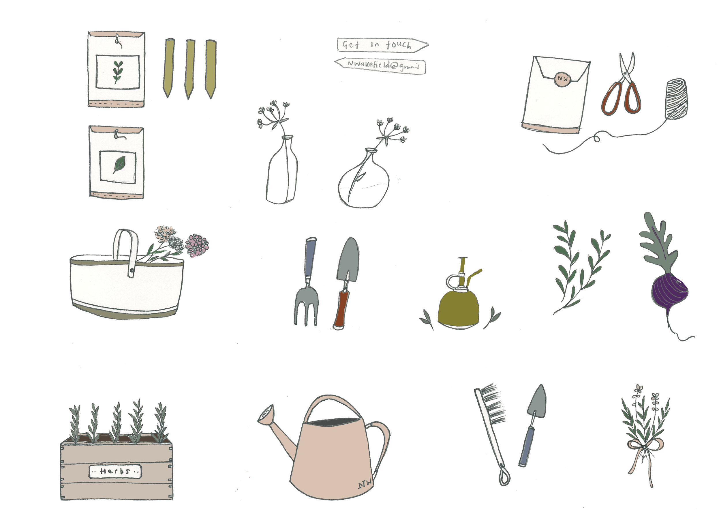
Nicola came to us as her brand needed a refresh and general overhaul. Nicola was torn between the style she wanted so we presented several options ranging from very traditional to whimsical with the use of illustration.
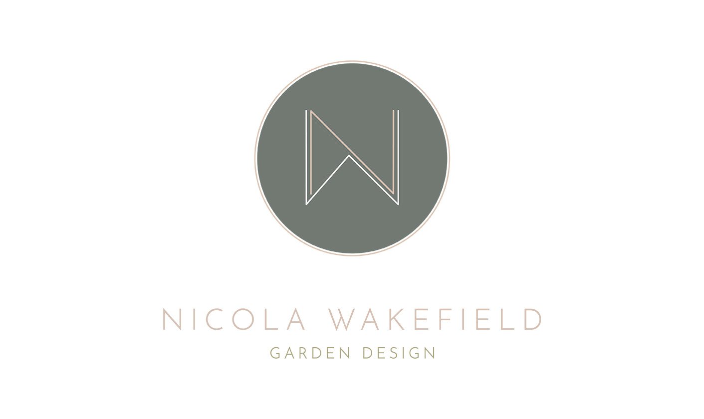
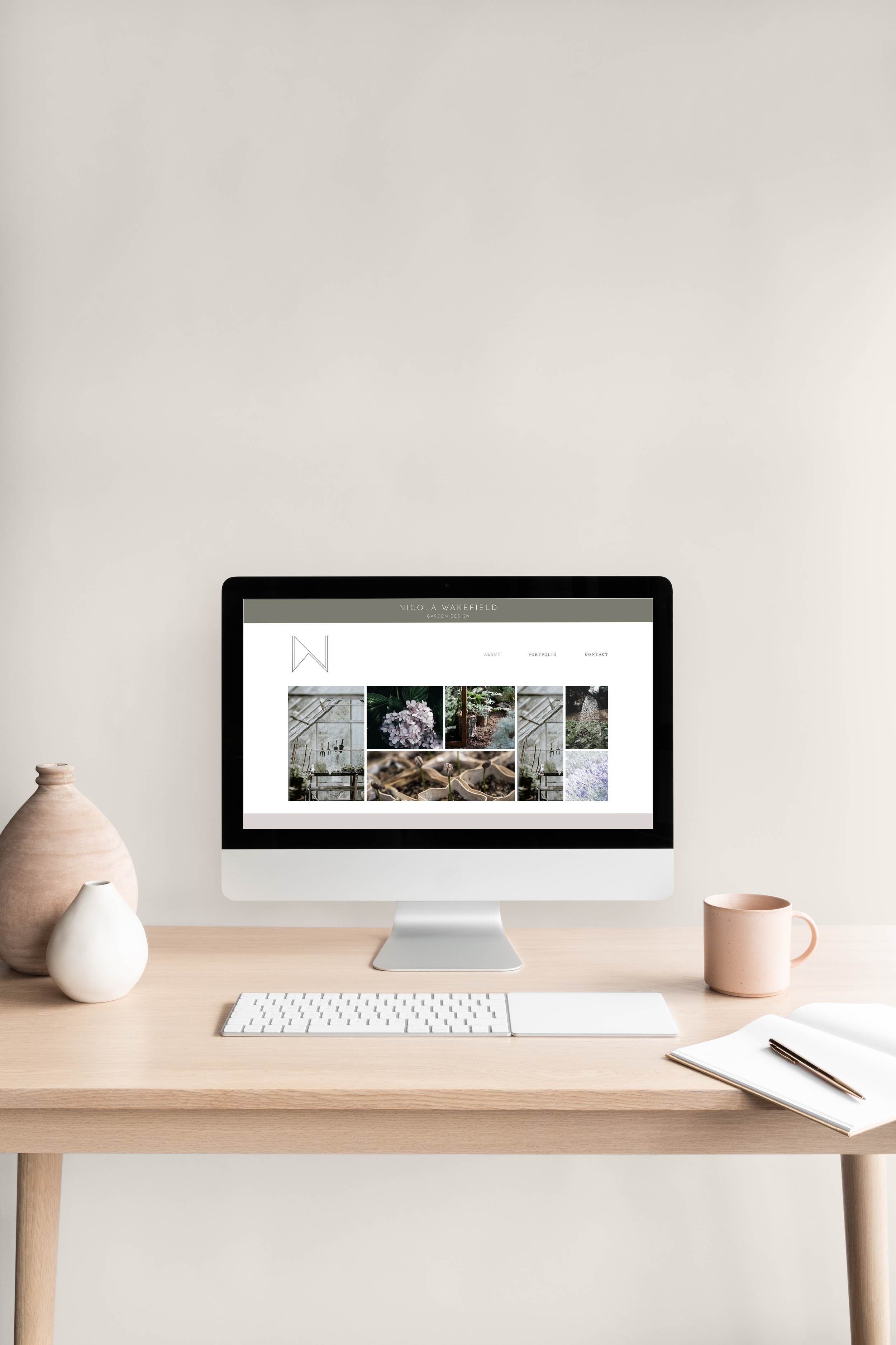
The logo Nicola chose in the end was a very contemporary one which reflects the style of gardens that she works on. A clean sans-serif font is used for both the marque and Nicola’s name. The use of earthy tones, such as greens, browns, or blues, evoke a sense of tranquility, growth, and harmony. High-quality imagery showcases the landscape designer's previous projects, highlighting the transformation of outdoor spaces into breathtaking gardens, serene retreats, or functional landscapes.